Manifold Public Design
A website for a creative studio that works across digital and physical space
I worked with Manifold Public Design's team to shape the content, layout and style of their website, then built it. Manifold is a creative studio for healthcare, education and public-service clients, with work ranging from branding and websites to interiors and fabrication.
- Role
- Web designer & builder
- Scope
- Stakeholder workshops, Content structure, Layout, Visual style, Website build
- Tools
- Wix
Who they are
Manifold Public Design is a creative studio built for a hybrid world. Its cross-functional team of designers, artists, fabricators, researchers and technologists shapes a client’s experience both online and in real life. A single project might include a new identity, a website, a campaign and the interior of a clinic.
The studio specializes in healthcare, education and other public-service organizations, and it starts from a simple belief: everyone deserves access to beautiful design, whether a project is big or small. Its values are openness, accessibility, beauty, inspiration and innovation. Every project starts with discovery, and clients are invited into the process from concept to rendering.
Its work spans four areas: digital design, brand identity and campaigns, marketing and content, and environmental design and fabrication. Recent projects include an identity and website refresh for Ellie Mental Health ahead of its national franchising, a Northwoods-inspired identity for Minnesota’s first psychedelic therapy clinic, and a physical-to-digital refresh for a Saint Paul charter school.
How we worked
Organize the content
Decide together what the site says, and where.
Set layout and style
Work out the layout and visual style together.
Build
Build the site on Wix.
1Organize the content
I worked closely with the studio’s stakeholders to decide what the site would say. Through exercises, workshops and co-working sessions, we organized the content together.
2Set layout and style
In the same sessions, we worked out the layout and settled the visual style.
3Build
Then I built the site on Wix.
The website
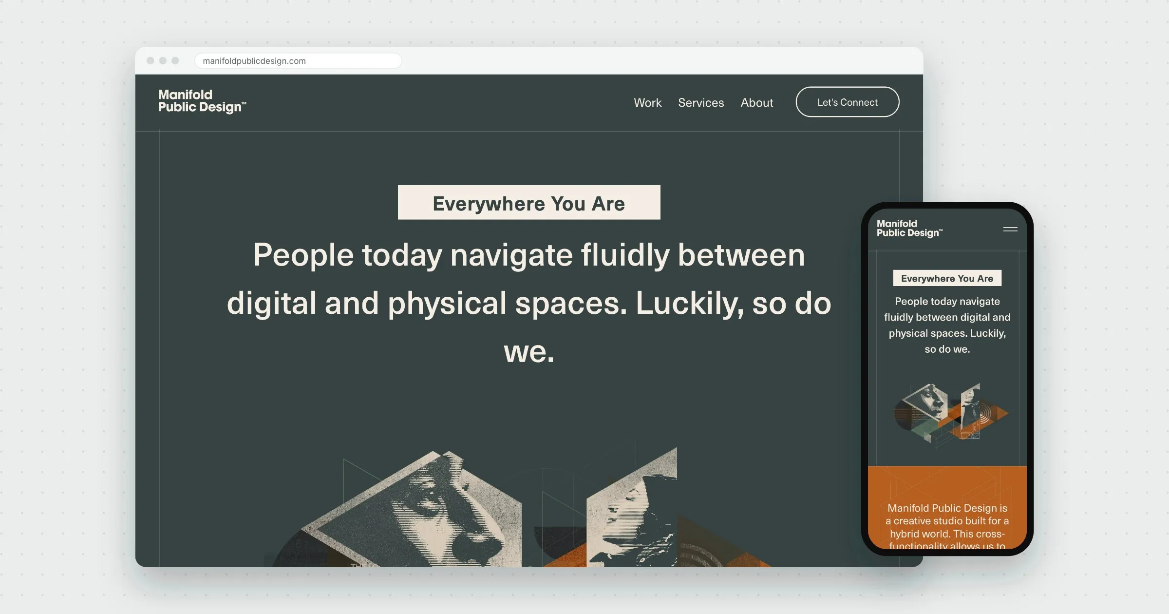
The site had one big idea to get across: a single studio that works across digital and physical space. The homepage says it directly, “People today navigate fluidly between digital and physical spaces. Luckily, so do we.” Then it lays out the four areas of focus, each paired with a collage of the studio’s work.
Further down, a featured project and a row of client logos show the work in practice, followed by the studio’s most popular services, from branding and websites to custom built-ins and video.
Beyond the homepage, Work collects the studio’s case studies and Services lists everything it offers by area. About sets out the values and approach, and Let’s Connect is a short, conversational contact form.