Redesigning sign-up for a food delivery app in Central America
I assessed sign-up for Cargill's food shopping app, redesigned how people sign up and sign in, and sketched the next features for the roadmap.
- Role
- UX designer & researcher
- Scope
- UX assessment, Journey and workflow mapping, Sign-up and sign-in flows, Feature concepts, Ways of working
- Tools
- Figma, Miro
The product
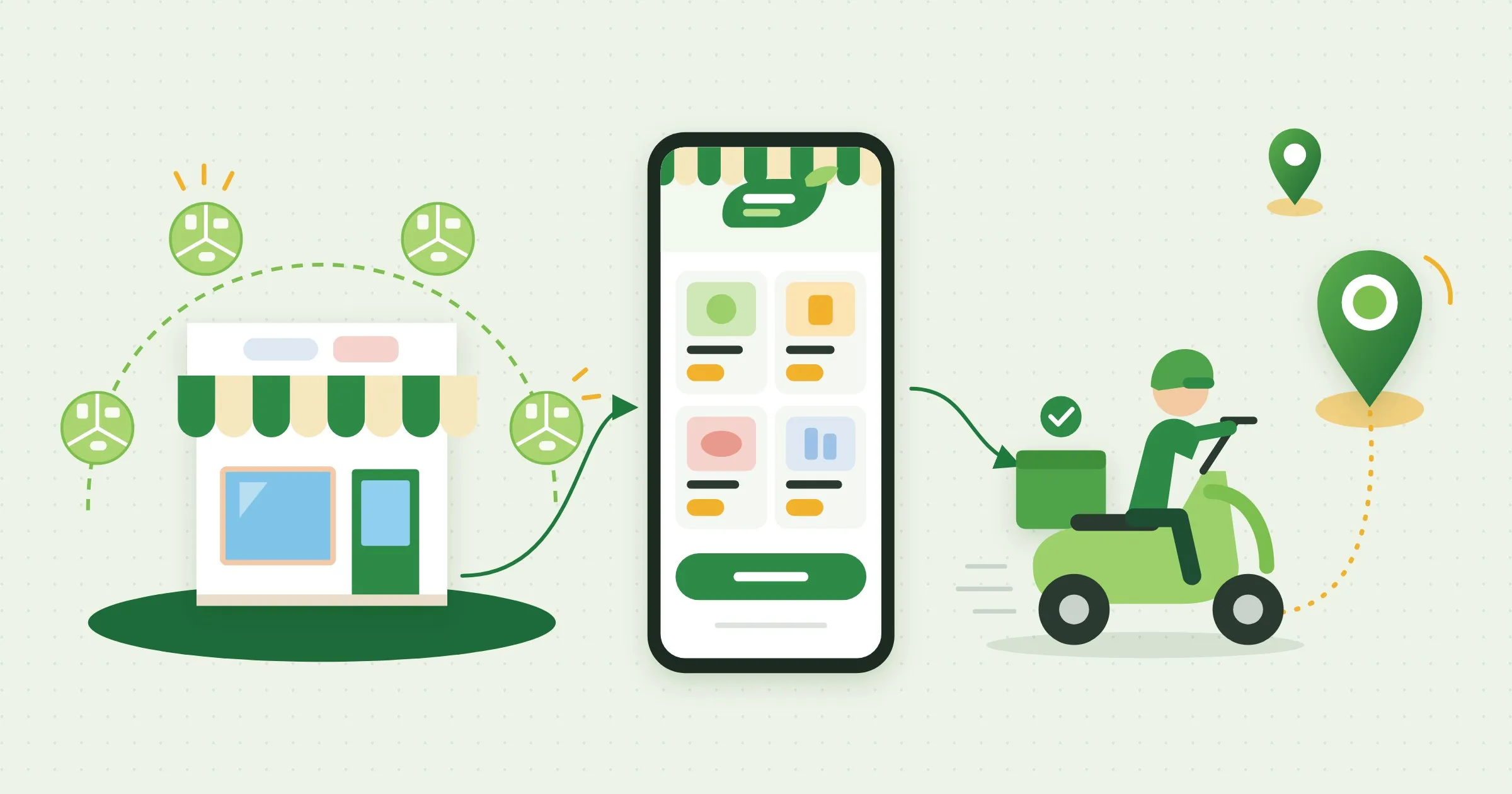
Aquí + Frescos is Cargill’s food shopping brand in Central America. People buy chicken, dairy, meat and groceries from Cargill’s own brands in one place, either at neighborhood stores or through a mobile app with home delivery.
The problem
New customers had to create an account before they could order, and sign-up and login were where they got stuck. The team needed a clear picture of the current experience before redesigning it, and a way for design to work with their product and development teams.
How the work ran
Map
The registration flow, the order workflow and the customer journey.
Assess
Findings by area, turned into opportunities.
Set the cadence
How design works with product and development.
Redesign
Sign-up and sign-in, end to end.
Look ahead
Concepts for the next features.
1Map
I mapped the registration flow end to end: every screen and decision a new customer goes through before they can shop. I also mapped the order workflow and the customer’s journey.
2Assess
I assessed the experience and grouped what I found by area, from login and password reset to the activation email. Then I turned the findings into ways to take the pain out of registration.
3Set the cadence
I set up how design would work with the team. I defined a work cadence that takes a ticket through research, concepts, team validation, prototyping, stakeholder validation and dev handoff with QA. I also organized the Figma file by stage, so everyone could see what was in exploration, up for review, waiting on approval or ready for development.
4Redesign
I redesigned sign-up and sign-in end to end. People can look around as a guest, choose their city first so they see local prices, and sign up with a social account or an email. Signing back in got the same care: clear help when a login fails, a simple way to reset a password, and Touch ID so returning customers can skip typing.
5Look ahead
Past those first pains, I laid out concepts for the home screen, search, checkout and the customer profile. They gave the team a starting point for each future feature, ready to place on the roadmap.
Result
The team got redesigned sign-up and sign-in flows, a working rhythm for design and development, and concepts for the next features ready to place on the roadmap.
Working diagramsThe order workflow and the user journey map.Password required