A self-serve customer portal with a guided request for access
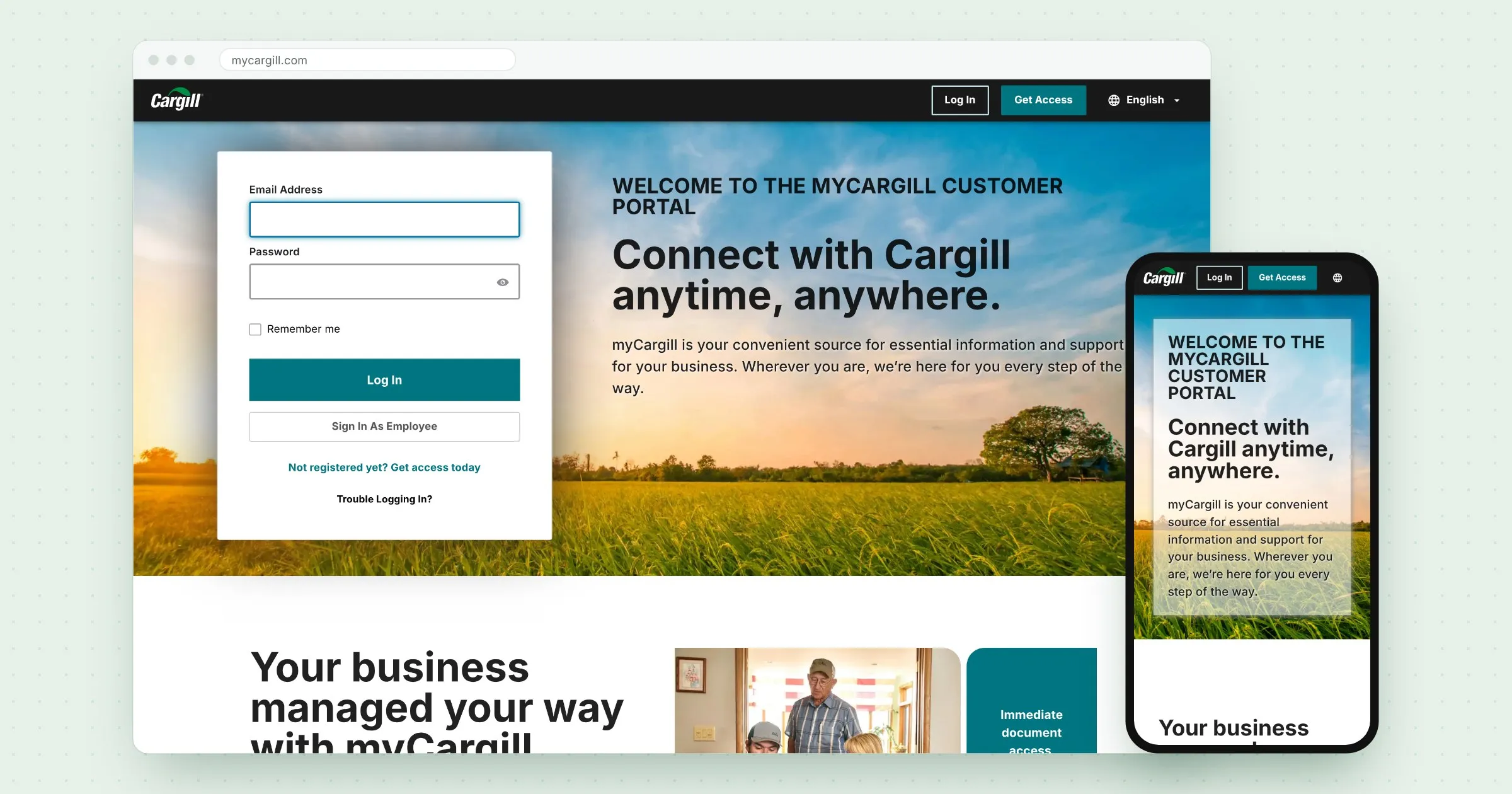
I designed the front door to myCargill, the portal where Cargill customers manage their business online, and a self-serve way to request access. It's still live today.
- Role
- UX/UI designer
- Scope
- Portal homepage, Access request flow, Responsive design
- Worked with
- Product owner, business analyst, developers
- Tools
- Figma, Cargill design system
- Live
- mycargill.com ↗
The challenge
Managing documents and day-to-day business with Cargill was disjointed, and getting in was the first hurdle. Before myCargill, a new customer usually had to email someone and wait to be set up with an account.
Cargill wanted one self-service place for customers to manage their business online. I designed the portal’s front door: the page customers land on before they sign in, and a way to request access on their own.
How it came together
I worked closely with the product owner and a business analyst. They brought the business needs, and I shaped them into screens that followed design best practices for the developers to build.
The portal ran alongside the build of Cargill’s design system, and we used it to test the system on a real product.
The customer’s path
Land
See what myCargill offers, with sign-in right there for returning customers.
Request
Ask for access in three short steps, without emailing anyone.
Confirm
Know the request went through and what happens next.
1Land
The homepage does two jobs at once. Returning customers can sign in straight away from the card on the left. Everyone else sees, in plain words, what myCargill is for, and gets a clear way to request access.
Further down the page, a short section explains what customers get: immediate access to documents, self-service and information around the clock. It’s paired with photos of the people Cargill works with.
2Request
Requesting access used to mean an email thread. I turned it into a short form split into three steps: contact details, business information, then the portal they need and why. A tracker at the top shows where they are and how much is left, so the form never feels longer than it is.
3Confirm
The last screen confirms the request was sent and tells customers what to do next: check their email to continue.
Live today
myCargill is still live at mycargill.com. The sign-in card beside the welcome message and the step-by-step request are still how customers get in. Since then, the portal has grown to cover Agriculture, Animal Nutrition and Food & Beverage, and the request now starts by asking how the person works with Cargill.
Result
The portal was well received. Customers got a simpler, self-service way in: they can find out what myCargill offers and request access on their own, without an email thread. The design system got tested on a real product along the way. And the front door I designed is still the way in today.